
Summary
Below, I write a bit retrospectively about my notes from the “Reducing Commercial Aviation Fatalities” kaggle, trying to summarize some of the journey. I try to give some high lights from my various notebook entries. ( github )
My High Level Recap
This physiology data classification challenge poses the question, given this time series voltage data of pilots’ respiration, electrocardiograms (ecg heart data), galvanic skin response (gsr), electroencephalography (eeg brain brain data) can something reliable be said about their physiological state? My response was to use this as an opportunity to learn about TensorFlow and LSTMs. I quickly discovered that data processing around time series data is 3 dimensional as opposed to typical 2 dimensional data. That means that the harmless 1.1 GiB of training data can quickly multiply to roughly 256 GiB if one is interested in using a 256 long sequence window. That means I learned a lot more about numpy for its simplicity around transforming 3 dimensional data. I had to adapt to using h5py chunks of data so as not to run out of memory quickly and not wait endless hours for training sessions to merely crash. As for TensorFlow and LSTMs, I did not realize right away but LSTMs (and likely neural nets in general) are quite sensitive to data that is not scaled and my logloss ended up reducing when I applied scaling techniques. Raw matplotlib became more intuitive for helping to visualize not just the time series data itself, but also for plotting logloss while training, across batches . . My Jupyter Notebook hygiene and workflow got better really quickly too, because I needed a reliable tool for distinguishing one day’s experiment from another’s without mixing the together the data or the models.
This dataset was highly skewed in terms of classes and so one of the really important preprocessing tasks was creating both balanced training “techniques” and balanced test data for more uniformly judging model performance. And I say “techniques”, because I tried both balanced weights and balanced training sets. I ended up preferring balanced training datasets, because that meant less preprocessing code.
The picture of Kaggle data I had in my head was clean datasets, but this dataset had one huge problem in that the time series data was not actually sorted by, you know, time. But in a way it is always fun to deal with messy data because it makes you more engaged with it and still more curious in the outcomes.
In general this project has given me a lot of fun memories.
One day after already getting deep into my LSTM approach, I decided to look through the Kaggle discussions for this project and I found that most people actually stuck to gradient boosting machines like lightGBM or XGBoost. But I decided to follow my personal motto of taking the path less traveled so I kept going with the LSTM .
I have spent I think half a year of weekends on this problem. I have memories of learning about neural network architecture learning “capacity” at my niece’s birthday party. I came to understand that creating a larger network can cause it to memorize more as opposed to generalize .
I remember tweaking my stochastic gradient descent batch size after reading this Yann LeCun tweet , “Training with large minibatches is bad for your health. More importantly, it’s bad for your test error. Friends dont let friends use minibatches larger than 32.” .
I also have memories of starting modeling experiments before going on runs and before going to sleep, so that I could let TensorFlow spin its wheels while I took my mind into strategy mode or just let myself meditate.
At one point I was at the Boston Amtrak terminal waiting for my bus, getting deeper into why it is handy to look at raw logit data coming out of a model, especially in a multiclass problem because it can show how strongly a model classifies each class. But applying the logistic function or a softmax is of course good for sussing out probabilities. But then I realized I was waiting for a bus at an Amtrak terminal and I had to sprint several blocks to actually catch my bus!
At the end of the day I think of all of the amazing things I could one day do with this kind of technology, such as classifying music or building a chat bot (maybe even one that can tell jokes).
Table of Contents
- Quick intro to the data
- The data is weirdly partially sorted
- Trickiness of the how the data is laid out (crews and seats?!)
- Some more visual inspection
- Building datasets
- Scaling
- Shuffling and adjusting dropout
- More epochs?
- Weight initialization
- Class balance
- Active Learning: changing the training approach
- Full training set error
- Shuffling train/test
- Reconsider that high dropout
- Prediction Speedup
Quick intro to the data
The physiological data includes several types (including respiration, electrocardiograms (ecg heart data), galvanic skin response (gsr), electroencephalography (eeg brain brain data)) across multiple "crews" . A crew includes two "seats" (0 and 1). We are provided with 256 measurements per second across three experiments (Channelized Attention (CA) , Diverted Attention (DA) and Startle/Surprise (SS) ). Across the three experiments, four target “states” (or classes) are labeled for all of the rows in the data.
The four classes of events in the training data, 'A', 'B', 'C', 'D' , correspond to three target physiological states of the three experiments, plus a neutral baseline state:
| label | description |
|---|---|
| A | Baseline |
| B | Startle/Surprise |
| C | Channelized Attention |
| D | Diverted Attention |
In my early notebook I took a quick look at the proportion of experiment time had been spent in the different states. Per the below, looking at each person separately, I saw that for the first person as an example, (crew=1, seat=0) , ~98% of CA was labeled as “Channelized Attention” and 2% as baseline. But for the other two experiments, the target states appear to be much more brief, with only 13% of the “DA” and 9% of the “SS” experiments.
(copying an output from that notebook…)
statsdf = gpdf.groupby(by=['crew', 'seat']).apply(extract_proportions).reset_index()
In [78]: statsdf
Out[78]:
    crew  seat      A/CA      A/DA      A/SS      C/CA      D/DA      B/SS
0      1     0  0.018593  0.868871  0.903015  0.981407  0.131129  0.096985
1      1     1  0.018803  0.879030  0.902685  0.981197  0.120970  0.097315
2      2     0  0.001954  0.857941  0.916630  0.998046  0.142059  0.083370
3      2     1  0.001781  0.848619  0.916605  0.998219  0.151381  0.083395
4      3     0  0.001248  0.854135  0.916782  0.998752  0.145865  0.083218
5      3     1  0.000597  0.860974  0.916772  0.999403  0.139026  0.083228
6      4     0  0.001302  0.868853  0.916514  0.998698  0.131147  0.083486
7      4     1  0.001400  0.860968  0.916706  0.998600  0.139032  0.083294
8      5     0  0.001661  0.847193  0.916730  0.998339  0.152807  0.083270
9      5     1  0.001791  0.857766  0.916472  0.998209  0.142234  0.083528
10     6     0  0.002311  0.860514  0.916711  0.997689  0.139486  0.083289
11     6     1  0.001661  0.858872  0.916748  0.998339  0.141128  0.083252
12     7     0  0.001563  0.867075  0.916536  0.998437  0.132925  0.083464
13     7     1  0.001607  0.855907  0.916471  0.998393  0.144093  0.083529
14     8     0  0.000999  0.856505  0.915394  0.999001  0.143495  0.084606
15     8     1  0.001053  0.853877  0.915412  0.998947  0.146123  0.084588
16    13     0  0.001801  0.841341  0.916482  0.998199  0.158659  0.083518
17    13     1  0.001628  0.847312  0.916595  0.998372  0.152688  0.083405
The data is weirdly partially sorted
As I mention in this notebook, when indexing on what I believe are the main uniqueness constraint columns (crew, seat, experiment), the time is not sorted. There are strange jumps, such as this one which I borrow from my notebook .. I show the first three rows (0, 1, 2) and also where I see the jump starting from around 6600, where row 6606 goes back in time.
pd.concat([
        df[['crew', 'seat', 'time', 'r', 'experiment', 'event']].iloc[:3],
        df[['crew', 'seat', 'time', 'r', 'experiment', 'event']].iloc[6600:6610]])
	crew	seat	time	r	experiment	event
0	1	1	0.011719	817.705994	CA	A
1	1	1	0.015625	817.705994	CA	A
2	1	1	0.019531	817.705994	CA	A
6600	1	1	109.988281	817.437988	CA	C
6601	1	0	109.988281	664.265991	CA	C
6602	1	0	109.992188	664.265991	CA	C
6603	1	1	109.992188	817.442017	CA	C
6604	1	1	109.996094	817.442017	CA	C
6605	1	0	109.996094	664.265991	CA	C
6606	1	0	11.000000	664.331970	CA	C
6607	1	1	11.000000	817.898987	CA	C
6608	1	0	11.003906	664.331970	CA	C
6609	1	1	11.003906	817.898987	CA	C
I sort this data myself, but it is confusing for sure.
Trickiness of the how the data is laid out (crews and seats?!)
In the process of visualizing data, I had been using matplot lib to visualize the four different classes of events, 'A', 'B', 'C', 'D' as red, green, blue and cyan. That way I could potentially try to get an intuition around the visual cues around state transitions. But at one point I had accidentally been combining the data of multiple people.
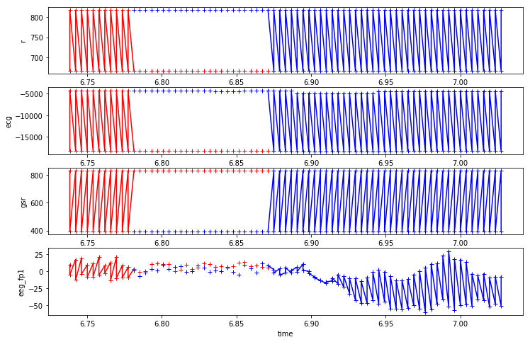
Above, extracting a plot from my 2019-10-26 notebook, is an example of where I plot combined multi seat data by accident. At one point this was weirding me out. But I realized finally that I had been combining the data of multiple people.
For diagram above (^^) , I had written a quick function produce_plots_for_col for plotting four features simultaneously, given a pandas dataframe, some features and an interval, but indeed the zig zag plot was a bit baffling for a bit.
start = 3400; produce_plots_for_col(df, ['r', 'ecg', 'gsr', 'eeg_fp1'],
                                range(start,start+150))
When I look back at my notebook I wrote about how I was very dumbfounded when I realized I combined them by accident. The data is complicated however. It includes four indexing columns: id , time , crew and seat . And indeed being careful with splitting this was key in creating good datasets.
Some more visual inspection
- in my 2019-06-08 notebook I used another nice quick visual inspection technique, looking at some time series data samples at the four classes,
Building datasets
- I spent a lot of time next building data sets, here , and , and building basic quick and dirty LSTM tensor flow models. And also .
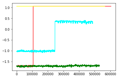
I also tried different approaches for understanding the models I was building. Including looking at raw logits, as per the below graphic, from my 2019-07-13-Four notebook. I thought this was a cool method compared to a confusion matrix for instance is because it shows the raw logits of each of the four classes, before the argmax voting observed in a confusion matrix is done.
Scaling
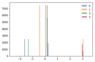
I took a deeper histogram look at my data, seeing quite a lot of ups and downs.
(Given that there were some crazy jumps, I thought I needed to do something about that)
And so
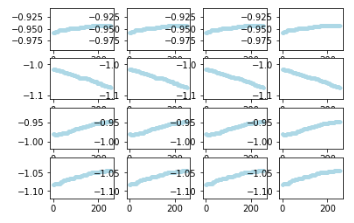
on 2019-12-21 , I ended up trying out more scaling approaches, especially MinMaxScaler. I had 8 features I was focusing on at that point and I plotted how my minMaxScaler min and max parameters changed as I processed roughly 40 or so mini datasets I had in my h5 training file data/2019-12-21T215926Z/train.h5. Re-posting my image :
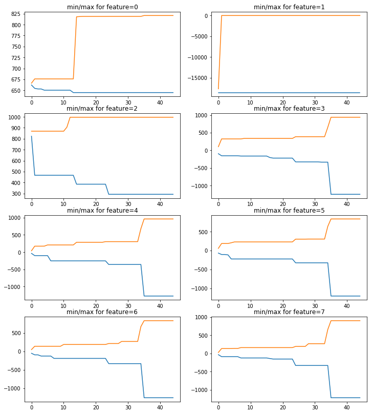
Luckily I found I was able to use just a single sklearn MinMaxScaler object to capture all 8 features at once.
I then applied the scalers to transform my train.h5 data to a train_scaled.h5 dataset. And I also ended up with a balanced dataset , train_balanced.h5, that I could use for training.
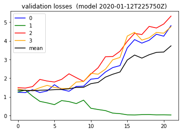
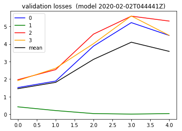
I trained a model and plotted training and validation loss curves the next day .
And wow the validation loss ( link ) looked intense ,
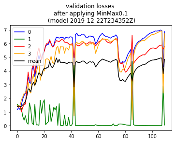
As a side note. although the validation loss here looks totally skewed towards class 1 , I want to step back and note I really appreciate the technique of actually creating the “balanced” test set I referred to above. That allows us to quickly knows the model is favoring one class over another in the first place. And also I really dig the technique of simply snapshotting the tensorflow models while training and then being able to know how the validation logloss looks across those training batches. I feel like combining these techniques was really helpful in digesting what is going on . I needed to enjoy little details like that amidst all of the trial and error that was happening here (Emphasis on the error part haha).
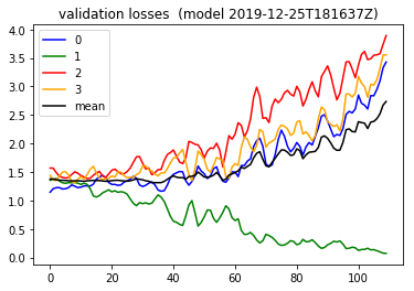
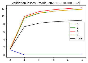
Shuffling and adjusting dropout
At a later date , I adjusted my lstm dropout from 0.2 to 0.7 , seeing quite different behavior in the validation loss. I had also added some shuffling code taking my 'history/2019-12-22T174803Z/train_balanced.h5' dataset to produce 'history/2019-12-22T174803Z/train_scaled_balanced_shuffled.h5' , to possibly change some of the choppiness of the validation curve seen above ^^ . That produced a validation loss , reposting the image here,
More epochs?
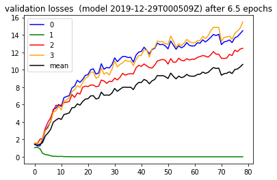
On 2018-12-28 I got curious about whether just throwing more data at this problem would help. So I extended my waiting time by two and let the training happen in two epochs . The validation loss from here , (reposting…) however showed that throwing more data is not always the answer. It always depends haha.
Weight initialization
Per my notebook entry I had read per this article that the default tensor flow weight initialization I had been using was GlorotUniform , ( which is aka Xavier Uniform apparently ) . I realized it was at least worth considering weight initialization as another hyper parameter so here I tried the Glorot or Xavier Normal instead . The validation loss did not necessarily convey the difference however:
At this point I think I was realizing that the order of ideas to try matters. And you do not know in advance what is the best order. Perhaps the weight initialization matters a good deal, but I had not yet found the critical next step yet at that point.
Class balance
In my next notebook I wanted to understand why my class 1 kept getting favored. I tried out forcing the weights of my training data to basically
{0: 1., 1: 0., 2: 0., 3: 0.}
to see what happens and sure enough, per the validation loss , the loss now went down only for class 0. So the effect was controlled.
Active Learning: changing the training approach
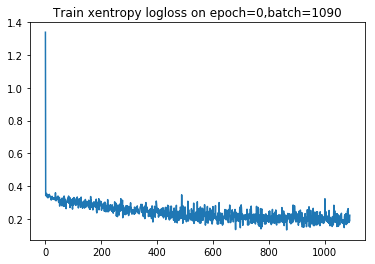
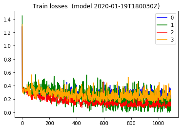
Somehow I came upon the idea of preferentially training on what your model is doing poorly on. So on 2020-01-19 I modified my training loop so that I dynamically adjusted my training weights according to which class was being misclassified. The effect on the training loss was really interesting. Everything was way smoother.
Looking at a training loss plot from earlier ( such as from 2019-12-28 )
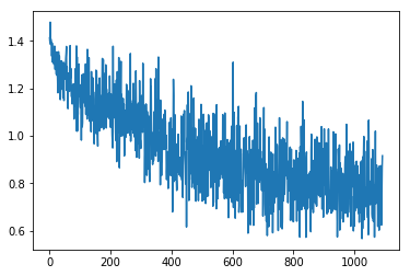 , it shows the batch loss is all over the place. That makes perferct sense perhaps, because each batch I have been using in stochastic gradient descent really is from all over the training data. And compared to the training loss plot for the two figures below (extracted from my [2020-01-19 notebook](https://github.com/namoopsoo/aviation-pilot-physiology-hmm/blob/master/notes/2020-01-19--update.md) ) the combined and per-class training batch losses are way more stable looking.
The validation loss was still favoring that one class, but I decided to hold on to this technique and keep trying other things.
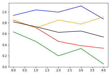
Full training set error
Next in this notebook I wanted to better answer whether my particular test set perhaps had some very different size data compared to my training set, which was blowing up my test set error. I did not have enough data to better split apart my data at the moment actually, but instead I took a quick detour to compare my training mini batch loss curves to the full training set losses, during training. Naturally one would expect that if batch training losses improve that overall training set loss should also improve. Per the below diagram from my notebook, that was indeed the case.
Shuffling train/test
After having consistently weird results with validation error, I decided to try re-building my train/test sets by doing a full random shuffle instead, in my 2020-02-01 notebook. Up until this point I had been using the fact that the data is divided into crew1, crew2, crew3, etc and I have used crew1 for train and crew2 for test. And I had built scalers from my crew1 training data, applying them to the the crew2 test data.
So this time around I instead built scalers from crew1 and then changed my function, build_many_scalers_from_h5 to take scalers as a parameter and I kept updating them with the test data. ( My scalers 'history/2020-02-02T044441Z/scalers.joblib' was the restulting artifact).
In validation , I think for the first time, I saw the validation error actually start going down ,
I took that further in this 2020-02-08 notebook and ( showing my figure again ) going 3 epochs instead, I got ..
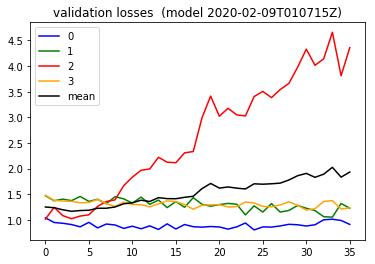
So the bright side I take from this is that the validation loss is actually doing better for three out of four of the classes.
Reconsider that high dropout
Next in 2020-02-15 notebook, I decided to reduce my dropout slightly, after reading through this post about treating the dropout as yet another hyperparameter. After retraining , across 2 epochs, I saw a validation loss curve, which looked better still.
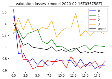
This indicates perhaps the context of hyperparameters being experimented with indeed matters . I think Andrew Ng’s characterization of “model babysitting”.
https://github.com/namoopsoo/aviation-pilot-physiology-hmm/blob/master/notes/2020-02-15.md
Prediction Speedup
At this point I had improved my validation results enough that I wanted to submit my predictions. But as I described in my notebook , the 17.9 million test examples would take potentially 25 hours per my back of the envelope calculation.
But luckily I discovered that just playing with my prediction batch size, changing it from 32 to 1024, I found I could cut my time from 56k examples/292 seconds to 56k examples/27s , taking the back of the envelope calculation from 25 hours to 2.5 hours !..
I also ended up utilizing awk to actually build batches for predict, avoiding trying to squeeze everything into memory.
And for one final optimization, I added multi-processing with joblib , to take advantage of all of my available cores.
The steps get more detailed in this notebook.