
Recently, myself and the rest of NYC went through a cold spell and news outlets reported2 the 13 day stretch of sub-zero weather, ending Feb 6th, was not longer than a 16 stretch in 1881. And this was shorter than a 1963 stretch, but tying a 2018-01-13 streak.
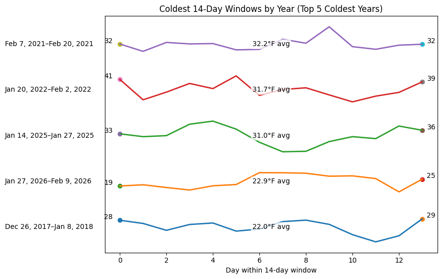
But this recent winter sure felt extreme. I know there is a recency bias, but I figured, why not also compare the area under the curve too. So I ranked the coldest 14-day stretches, using available data of the past decade. And then tried to visualize the spans of the coldest years too.
But even by that measure, it still looks like 2018 was colder.
Sourcing
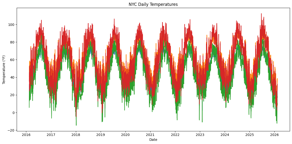
Doing this all with a ChatGPT agent, that obtained the data from a weather api I hadn’t heard about before, open meteo1, so I figured let’s just plot all the data first as a sanity check.
Implementation note
The full source code is available here3.
from brr_cold.download import download_open_meteo
# download_open_meteo()
from brr_cold.winter import plot_full_timeseries, load_open_meteo_archive_json

weather = load_open_meteo_archive_json("data/archive.json")
df = weather.df
df.head()
| date | low_temp_F | high_temp_F | feels_like_low_F | feels_like_high_F | sunrise | sunset |
|---|---|---|---|---|---|---|
| date | f64 | f64 | f64 | f64 | datetime[μs] | datetime[μs] |
| 2016-02-15 | 13.3 | 40.5 | 5.7 | 35.6 | 2016-02-15 06:50:00 | 2016-02-15 17:30:00 |
| 2016-02-16 | 32.0 | 52.7 | 24.6 | 45.5 | 2016-02-16 06:49:00 | 2016-02-16 17:31:00 |
| 2016-02-17 | 29.0 | 42.6 | 21.3 | 33.9 | 2016-02-17 06:47:00 | 2016-02-17 17:32:00 |
| 2016-02-18 | 23.9 | 34.9 | 14.6 | 24.5 | 2016-02-18 06:46:00 | 2016-02-18 17:33:00 |
| 2016-02-19 | 21.1 | 35.3 | 13.2 | 26.9 | 2016-02-19 06:45:00 | 2016-02-19 17:34:00 |
plot_full_timeseries(df)
What to compare
I wanted to compare the area under the curve, but I didn’t want to mess around with negative numbers, so I figured it would be safer to use the highs and not the lows, since the Fahrenheit lows will have negatives, but in NY, spot checking, I didn’t see any days where there were highs that were negative Fahrenheit. This is not yet the arctic luckily!
So here is how I phrased the metric for comparison in my ChatGPT prompt, for using the feels like data and just the standard temperature data too.
w14_feels_like_high_F(t) = feels_like_high_F(t - 14) + feels_like_high_F(t - 13) + ... + feels_like_high_F(t - 1)
w14_high_temp_F(t) = w14_high_temp_F(t - 14) + w14_high_temp_F(t - 13) + ... + w14_high_temp_F(t - 1)
Ranked spans
Initially, I was kind of shocked I didn’t see 2026 data anywhere in the rolling window data, but then I realized oops I was using data up to 2025-02-14 instead of 2026-02-14 yikes! Then I pulled with the additional year and yes, both 2026 and 2018 were filling up the coldest 14-day stretches.
from brr_cold.winter import add_rolling_14day_averages_excluding_today

df2 = add_rolling_14day_averages_excluding_today(df)
df2[-50:]
| date | low_temp_F | high_temp_F | feels_like_low_F | feels_like_high_F | sunrise | sunset | w14_high_avg_F | w14_feels_like_high_avg_F |
|---|---|---|---|---|---|---|---|---|
| date | f64 | f64 | f64 | f64 | datetime[μs] | datetime[μs] | f64 | f64 |
| 2025-12-27 | 17.5 | 30.2 | 9.8 | 22.4 | 2025-12-27 07:19:00 | 2025-12-27 16:35:00 | 38.835714 | 32.05 |
| 2025-12-28 | 11.2 | 34.6 | 4.2 | 28.4 | 2025-12-28 07:19:00 | 2025-12-28 16:36:00 | 38.221429 | 31.364286 |
| 2025-12-29 | 28.5 | 45.2 | 17.8 | 38.3 | 2025-12-29 07:19:00 | 2025-12-29 16:37:00 | 38.357143 | 31.442857 |
| 2025-12-30 | 26.0 | 31.5 | 16.5 | 20.5 | 2025-12-30 07:20:00 | 2025-12-30 16:37:00 | 39.671429 | 32.835714 |
| 2025-12-31 | 25.4 | 31.5 | 15.9 | 21.4 | 2025-12-31 07:20:00 | 2025-12-31 16:38:00 | 39.935714 | 32.814286 |
| … | … | … | … | … | … | … | … | … |
| 2026-02-10 | 14.3 | 31.5 | 6.9 | 23.6 | 2026-02-10 06:55:00 | 2026-02-10 17:24:00 | 22.885714 | 14.871429 |
| 2026-02-11 | 30.6 | 38.1 | 21.2 | 30.9 | 2026-02-11 06:54:00 | 2026-02-11 17:25:00 | 23.792857 | 15.907143 |
| 2026-02-12 | 23.4 | 33.5 | 14.6 | 24.6 | 2026-02-12 06:53:00 | 2026-02-12 17:27:00 | 25.092857 | 17.271429 |
| 2026-02-13 | 16.7 | 34.0 | 8.1 | 27.5 | 2026-02-13 06:52:00 | 2026-02-13 17:28:00 | 26.235714 | 18.392857 |
| 2026-02-14 | 18.0 | 38.8 | 10.4 | 32.5 | 2026-02-14 06:51:00 | 2026-02-14 17:29:00 | 27.571429 | 19.907143 |
print(
    df2.drop_nulls()
    .sort("w14_high_avg_F", descending=False)
    [:10]
    .select("date", "w14_high_avg_F", "w14_feels_like_high_avg_F"))
shape: (10, 3)
┌────────────┬────────────────┬───────────────────────────┐
│ date       ┆ w14_high_avg_F ┆ w14_feels_like_high_avg_F │
│ ---        ┆ ---            ┆ ---                       │
│ date       ┆ f64            ┆ f64                       │
╞════════════╪════════════════╪═══════════════════════════╡
│ 2018-01-09 ┆ 22.035714      ┆ 10.592857                 │
│ 2018-01-08 ┆ 22.692857      ┆ 11.378571                 │
│ 2018-01-10 ┆ 22.807143      ┆ 11.642857                 │
│ 2026-02-10 ┆ 22.885714      ┆ 14.871429                 │
│ 2026-02-09 ┆ 22.992857      ┆ 14.935714                 │
│ 2026-02-07 ┆ 23.221429      ┆ 15.078571                 │
│ 2018-01-11 ┆ 23.628571      ┆ 12.721429                 │
│ 2026-02-08 ┆ 23.692857      ┆ 15.735714                 │
│ 2026-02-11 ┆ 23.792857      ┆ 15.907143                 │
│ 2026-02-06 ┆ 23.814286      ┆ 15.35                     │
└────────────┴────────────────┴───────────────────────────┘
Lets look at the coldest streak for each year
And let’s stack the coldest
from brr_cold.winter import stacked_plot_top5_coldest_years
stacked_plot_top5_coldest_years(df2)
Note about how this blog post was implemented
This blog post, unlike others in the past, was built purely from the jupyter notebook4 in git, using jupyter nbconvert, except for uploading the final images to my cdn, which hopefully I can automate too one day.
Most of the code was built through Chat GPT prompts except for some parts that were output as pandas that I converted to polars by hand.