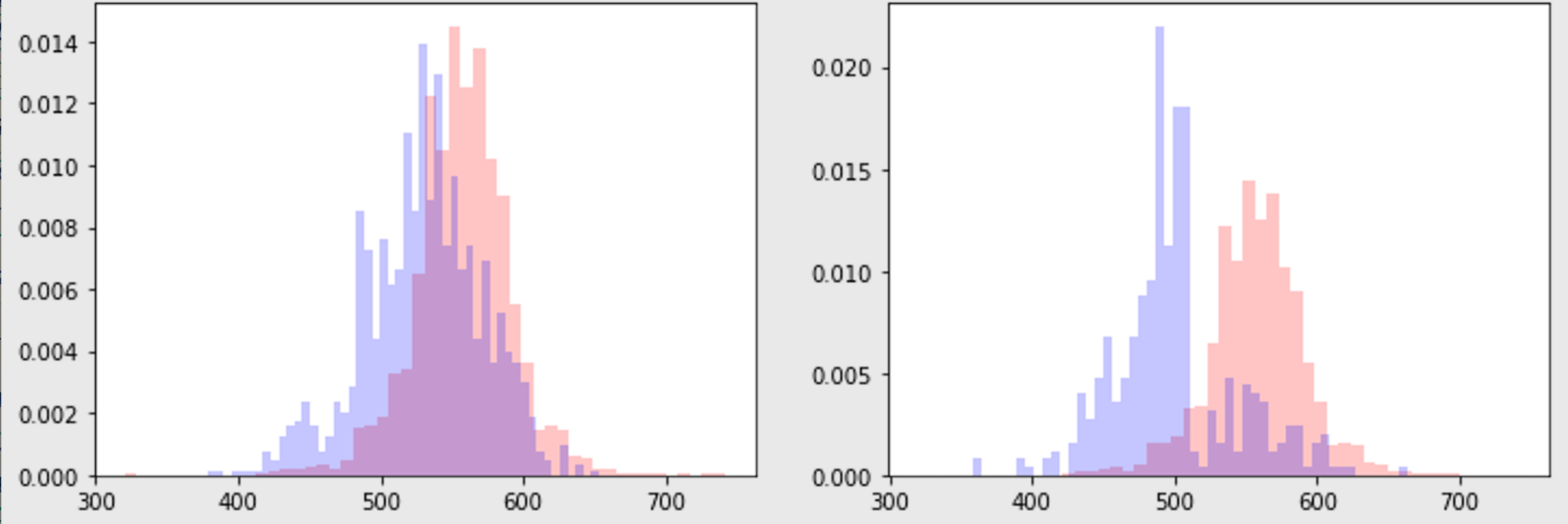
histogram overlays
# Nice technique from https://srome.github.io/Covariate-Shift,-i.e.-Why-Prediction-Quality-Can-Degrade-In-Production-and-How-To-Fix-It/
# ... put two histograms on same plot ...

def produce_overlayed_hists_for_col_dfs(col, dfs):
    fig = plt.figure(figsize=(12,12))

    ax = fig.add_subplot(121)
    ax.hist(dfs[0][1][col], color='r', alpha=0.2, bins=50)
    ax.hist(dfs[1][1][col], color='b', alpha=0.2, bins=50)
    ax.set(title=f'{dfs[0][0]} (red) vs {dfs[1][0]} (blue)',
            ylabel=col)
Basic goal looks like the below.
sparse diagonal x axis ticks
import matplotlib.pyplot as plt
import pandas as pd
import datetime

def make_xtick_labels(x, step=5):
    '''Given x, step the labels every <step>
    Aka, take every <step>th x label
    '''
    x_ticks = [i for i in  range(len(x)) if i % step == 0]
    x_labels = [x[i] for i in x_ticks]
    return x_ticks, x_labels
- Did not add an example
x,yyet, but showing an example wherexcontains dates andyis numeric.
x = ?
y = ?

fig = plt.figure(figsize=(12,4))
ax = fig.add_subplot(111)
ax.plot(y)
x_ticks, x_labels = make_xtick_labels(x, step=20)
ax.set_xticks(x_ticks)
ax.set_xticklabels(x_labels, rotation=-45)
fig.show()

Multiple time plots and fill nulls with zeroes!
- Need to fill the nulls, otherwise the behavior can be weird.
- Here, have a
dfwithtimestampandlabel, that is sparse, (meaning there are missing rows)
import matplotlib.pyplot as plt
import pandas as pd
import datetime
import random

def random_df(size=500):
    X = [random.random() for _ in range(size)]
    vec = []
    for (i, x) in enumerate(X):
    	vec.extend([{
    		"label": ("one" if x <= 0.33 else ("two" if 0.33 < x <= 0.66 else "three")),
		"timestamp": datetime.date(2021, 1, 1) + datetime.timedelta(days=1*i)
    }
    for _ in range(random.randint(0, 50))
    ])
    return pd.DataFrame.from_records(vec)


def fill_empties(statsdf):
    statsdf = statsdf.copy()
    for x in statsdf["date"].unique().tolist():
        for label in statsdf.label.unique().tolist():
            if statsdf[(statsdf.date == x) & (statsdf.label == label)].empty:
                statsdf = pd.concat([statsdf,
                    pd.DataFrame.from_records([{"date": x, "label": label, "count": 0}])],
                    ignore_index=True
                )
    statsdf = statsdf.sort_values(by=["date", "label"])
    return statsdf


def plot_trends(df, out_loc):
    statsdf = df.groupby(by=['date', 'label']).size().reset_index().rename(columns={0: "count"})
    statsdf = fill_empties(statsdf)

    fig = plt.figure(figsize=(12,4))
    ax = fig.add_subplot(111)
    x = statsdf.date.unique().tolist()
    x_ticks, x_labels = make_xtick_labels(x, step=3)
    for label in statsdf.label.unique().tolist():
        x = statsdf[statsdf.label == label]['date'].tolist()
        y = statsdf[statsdf.label == label]['count'].tolist()
        ax.plot(x, y, label=label)

    ax.set_xticks(x_ticks)
    ax.set_xticklabels(x_labels, rotation=-45)

    ax.legend()
    print('saving to ', out_loc)
    pylab.savefig(out_loc)
    pylab.close()

#
df = random_df(100)
df["date"] = df["timestamp"].map(lambda x:x.strftime("%m-%d"))
workdir = "some_folder"
out_loc = f"{workdir}/trends.png"
plot_trends(df, out_loc)

Heatmaps are nice
plt.figure(figsize=(10,10))
plt.imshow(bitmap)
plt.colorbar()
plt.grid(False)
plt.show()
using np.histogram and quantiles to spot check bimodal distributions
- I had this use case where I wanted to collect walltime from a service, from a dataset where a bimodal distribution was basically a given. I wanted thea mean of the second distribution.
- Instead of trying to use clustering analysis like dbscan which would have probably worked, I just started collecting the time series
np.histogramand quantile data and I was able to visually inspect / prove that the median is a good enough statistic in this case, without too much extra data preprocessing required! - sampling data from athena every 7 days , here are two examples below.


- supporting codes… (I didnt add code for
daa.run_itbut basically that just pulls data into a dataframe with a columnbackend_processing_timethat is being used here. Andmake_queryjust makes a query for a particular date to pull that data. So nothing really special about those. They can be replaced with any particular method of gathering data.)
import datetime
from tqdm import tqdm
d1 = datetime.date(2019, 1, 1)
d2 = datetime.date(2020, 7, 1)
dd = ddu.range_dates(d1, d2, 7)

# outvec = []
for dt in tqdm(dd):
    query = make_query(dt)
    athenadf = daa.run_it(query, query_name='Unsaved')

    hist = np.histogram(athenadf.backend_processing_time.tolist(),
                    bins=10, range=None)
    mean = np.mean(athenadf.backend_processing_time.tolist())
    quantiles = get_quantiles(athenadf.backend_processing_time.tolist())
    outvec.append({'hist': hist, 'quantiles': quantiles,
                  'date': dt.strftime('%Y-%m-%d'),
                  'mean': mean})
import numpy as np
import matplotlib.pyplot as plt
def get_quantiles(unsorted):
    data = sorted(unsorted)
    minimum = data[0]
    Q1 = np.percentile(data, 25, interpolation = 'midpoint')
    median = np.median(data)
    Q3 = np.percentile(data, 75, interpolation = 'midpoint')
    maximum = data[-1]
    return [minimum, Q1, median, Q3, maximum]

def show_da_stats(bundle):
    H, bins = bundle['hist']
    quantiles = bundle['quantiles']
    # plt.plot(x[1][:-1], x[0], drawstyle='steps')
    #print(H, bins)
    #print(quantiles)
    plt.scatter(quantiles, [1, 1, 1, 1, 1])
    plt.axvline(quantiles[1], label='q:25%')
    plt.axvline(quantiles[2], label='q:50%')
    plt.axvline(quantiles[3], label='q:75%')

    plt.title(f"walltime histogram at {bundle['date']}")
    plt.plot(bins, np.insert(H, 0, H[0]), drawstyle='steps', color='green')
    plt.grid(True)
    plt.legend()
    plt.show()

bundle = outvec[0]
show_da_stats(bundle)
Nice how you can save figures from ipython if you need to
import pylab
import matplotlib.pyplot as plt
plt.hist([1,2,3,4,1,2,3,4,1,2,1,2,2], bins=50)
plt.title('Histogram blah')
out_loc = '/your/location.blah.png'
print('saving to ', out_loc)
pylab.savefig(out_loc)
pylab.close()
Running this in a jupyter notebook
- (NOTE: this data is from one of the Keras Hello World datasets) , per below
import matplotlib.pyplot as plt

image = [[0, 0, 0, 0, 0, 0, 0, 0, 33, 96, 175, 156, 64, 14, 54, 137, 204, 194, 102, 0, 0, 0, 0, 0, 0, 0, 0, 0], [0, 0, 0, 0, 0, 0, 73, 186, 177, 183, 175, 188, 232, 255, 223, 219, 194, 179, 186, 213, 146, 0, 0, 0, 0, 0, 0, 0], [0, 0, 0, 0, 0, 35, 163, 140, 150, 152, 150, 146, 175, 175, 173, 171, 156, 152, 148, 129, 156, 140, 0, 0, 0, 0, 0, 0], [0, 0, 0, 0, 0, 150, 142, 140, 152, 160, 156, 146, 142, 127, 135, 133, 140, 140, 137, 133, 125, 169, 75, 0, 0, 0, 0, 0], [0, 0, 0, 0, 0, 54, 167, 146, 129, 142, 137, 137, 131, 148, 148, 133, 131, 131, 131, 125, 140, 140, 0, 0, 0, 0, 0, 0], [0, 0, 0, 0, 0, 0, 110, 188, 133, 146, 152, 133, 125, 127, 119, 129, 133, 119, 140, 131, 150, 14, 0, 0, 0, 0, 0, 0], [0, 0, 0, 0, 0, 0, 0, 221, 158, 137, 135, 123, 110, 110, 114, 108, 112, 117, 127, 142, 77, 0, 0, 0, 0, 0, 0, 0], [0, 0, 0, 0, 0, 4, 0, 25, 158, 137, 125, 119, 119, 110, 117, 117, 110, 119, 127, 144, 0, 0, 0, 0, 0, 0, 0, 0], [0, 0, 0, 0, 0, 0, 0, 0, 123, 156, 129, 112, 110, 102, 112, 100, 121, 117, 129, 114, 0, 0, 0, 0, 0, 0, 0, 0], [0, 0, 0, 0, 0, 0, 0, 0, 125, 169, 127, 119, 106, 108, 104, 94, 121, 114, 129, 91, 0, 0, 0, 0, 0, 0, 0, 0], [0, 0, 0, 0, 0, 0, 2, 0, 98, 171, 129, 112, 104, 114, 106, 102, 112, 104, 133, 64, 0, 4, 0, 0, 0, 0, 0, 0], [0, 0, 0, 0, 0, 0, 2, 0, 66, 173, 135, 129, 98, 100, 119, 102, 108, 98, 135, 60, 0, 4, 0, 0, 0, 0, 0, 0], [0, 0, 0, 0, 0, 0, 2, 0, 56, 171, 135, 127, 100, 108, 117, 85, 106, 110, 135, 66, 0, 4, 0, 0, 0, 0, 0, 0], [0, 0, 0, 0, 0, 0, 0, 0, 52, 150, 129, 110, 100, 91, 102, 94, 83, 104, 123, 66, 0, 4, 0, 0, 0, 0, 0, 0], [0, 0, 0, 0, 0, 0, 2, 0, 66, 167, 140, 148, 148, 127, 137, 152, 146, 146, 148, 96, 0, 0, 0, 0, 0, 0, 0, 0], [0, 0, 0, 0, 0, 0, 0, 0, 45, 123, 94, 104, 96, 119, 121, 106, 98, 112, 87, 114, 0, 0, 0, 0, 0, 0, 0, 0], [0, 0, 0, 0, 0, 0, 0, 0, 106, 89, 58, 50, 37, 50, 66, 56, 50, 75, 75, 137, 22, 0, 2, 0, 0, 0, 0, 0], [0, 0, 0, 0, 0, 2, 0, 29, 148, 114, 106, 125, 89, 100, 133, 117, 131, 131, 131, 125, 112, 0, 0, 0, 0, 0, 0, 0], [0, 0, 0, 0, 0, 0, 0, 100, 106, 114, 91, 137, 62, 102, 131, 89, 135, 112, 131, 108, 135, 37, 0, 0, 0, 0, 0, 0], [0, 0, 0, 0, 0, 0, 0, 146, 100, 108, 98, 144, 62, 106, 131, 87, 133, 104, 160, 117, 121, 68, 0, 0, 0, 0, 0, 0], [0, 0, 0, 0, 0, 0, 33, 121, 108, 96, 100, 140, 71, 106, 127, 85, 140, 104, 150, 140, 114, 89, 0, 0, 0, 0, 0, 0], [0, 0, 0, 0, 0, 0, 62, 119, 112, 102, 110, 137, 75, 106, 144, 81, 144, 108, 117, 154, 117, 104, 18, 0, 0, 0, 0, 0], [0, 0, 0, 0, 0, 0, 66, 121, 102, 112, 117, 131, 73, 104, 156, 77, 137, 135, 83, 179, 129, 121, 35, 0, 0, 0, 0, 0], [0, 0, 0, 0, 0, 0, 85, 127, 81, 125, 133, 119, 79, 100, 169, 83, 129, 175, 60, 163, 135, 146, 39, 0, 0, 0, 0, 0], [0, 0, 0, 0, 0, 0, 106, 129, 62, 140, 144, 108, 85, 83, 158, 85, 129, 175, 48, 146, 133, 135, 64, 0, 0, 0, 0, 0], [0, 0, 0, 0, 0, 0, 117, 119, 79, 140, 152, 102, 89, 110, 137, 96, 150, 196, 83, 144, 135, 133, 77, 0, 0, 0, 0, 0], [0, 0, 0, 0, 0, 0, 154, 121, 87, 140, 154, 112, 94, 52, 142, 100, 83, 152, 85, 160, 133, 100, 12, 0, 0, 0, 0, 0], [0, 0, 0, 0, 0, 0, 4, 0, 2, 0, 35, 4, 33, 0, 0, 0, 0, 0, 0, 0, 0, 0, 0, 0, 0, 0, 0, 0]]


plt.figure()
plt.imshow(train_images[3])
plt.colorbar()
plt.grid(False)
plt.show()
- And wow that displays…

And the matplot grid , wow this is cool too
- Example code from this tutorial
- According to
help(plt.subplot),plt.subplot(5, 5, i)below is an instruction to place theith thing, within a5x5grid, so basically the count starts at0from the upper left corner and spreads the grid as if it were a tape, from0to5*5 - 1
plt.figure(figsize=(10,10))
for i in range(25):
    plt.subplot(5,5,i+1)
    plt.xticks([])
    plt.yticks([])
    plt.grid(False)
    plt.imshow(train_images[i]) # , cmap=plt.cm.binary
    plt.xlabel(class_names[train_labels[i]])
plt.show()


Obtaining image data
from tensorflow import keras

fashion_mnist = keras.datasets.fashion_mnist

(train_images, train_labels), (test_images, test_labels) = fashion_mnist.load_data()

image = train_mages[3]
Plot colors
With tips from here, for setting the background color to green instead of transparent so that when displaying on a dark-mode page, the black axis letters are still visible instead of hidden, opaque, invisible, not seen, missing, cannot see them, or assumed cut off, etc.
# print(plt.style.available)
# ['Solarize_Light2', '_classic_test_patch', 'bmh', 'classic', 'dark_background', 'fast', 'fivethirtyeight', 'ggplot', 'grayscale', 'seaborn', 'seaborn-bright', 'seaborn-colorblind', 'seaborn-dark', 'seaborn-dark-palette', 'seaborn-darkgrid', 'seaborn-deep', 'seaborn-muted', 'seaborn-notebook', 'seaborn-paper', 'seaborn-pastel', 'seaborn-poster', 'seaborn-talk', 'seaborn-ticks', 'seaborn-white', 'seaborn-whitegrid', 'tableau-colorblind10']

fig = plt.figure(figsize=(6, 6))
fig.patch.set_facecolor('xkcd:mint green')
ax = fig.add_subplot(111, )
ax.hist([1, 2, 1, 2, 2, 3, 4, 5, 6], bins=2, )

ax.set_facecolor('xkcd:salmon')
    #plt.show(transparent=False)
    #help(ax) # set_subplotspec

- For the background this also helped.. ( per here )
# print(plt.style.available)
# ['Solarize_Light2', '_classic_test_patch', 'bmh', 'classic', 'dark_background', 'fast', 'fivethirtyeight', 'ggplot', 'grayscale', 'seaborn', 'seaborn-bright', 'seaborn-colorblind', 'seaborn-dark', 'seaborn-dark-palette', 'seaborn-darkgrid', 'seaborn-deep', 'seaborn-muted', 'seaborn-notebook', 'seaborn-paper', 'seaborn-pastel', 'seaborn-poster', 'seaborn-talk', 'seaborn-ticks', 'seaborn-white', 'seaborn-whitegrid', 'tableau-colorblind10']
with plt.style.context('fivethirtyeight'):
    fig = plt.figure(figsize=(6, 6))
    ax = fig.add_subplot(111, )
    ax.hist([1, 2, 1, 2, 2, 3, 4, 5, 6], bins=2, )

- more colors
How to display a png from a file
from IPython.display import Image, display
loc = 'somefile.png'
display(Image(filename=loc))
Prevent some parts of figure from getting cut off
- This
bbox_inches='tight'option really helps
with plt.style.context('fivethirtyeight'):
    plt.plot(np.random.randint(0, 100, size=100), np.random.randint(0, 100, size=100))
    plt.title('blah title')
    out_loc = 'blah.png'
    print('saving to ', out_loc)
    pylab.savefig(out_loc, bbox_inches='tight')
    pylab.close()
Another way of preventing smushing
Similar to the above, I learned about a non pylab native matplotlib.pyplot option for avoiding multi plot figure covering each other, overlapping , getting crammed. (Just including many synonyms for crowding so I can find this more easily :) )
Basically if you define, a figure, you can do this , as I learned from stacko recently,
fig = plt.figure(figsize=(12,12))
for i in range(5):
    ax = fig.add_subplot(int(f"51{i + 1}"))
    ...
fig.tight_layout()
And
plt.tight_layout()
is also available, and when I was trying this out, I used the latter because the former was not quite working for me.
Maybe the former was not working because I used fig.add_suplot as opposed to plt.subplots as shown in the stacko example I linked above. ^^ So below is the example,
show adding it verbatim here below
import matplotlib.pyplot as plt

fig, axes = plt.subplots(nrows=4, ncols=4, figsize=(8, 8))
fig.tight_layout() # Or equivalently,  "plt.tight_layout()"

plt.show()
How to use plt.subplots , iterate across the axes,
Here is an example, three histograms across three columns, category, name, description,
fig, axes = plt.subplots(figsize=(12,6), nrows=3, ncols=1)
fig.patch.set_facecolor("xkcd:mint green")
plt.tight_layout()
for i, col in enumerate(["category", "name", "description"]):
    menusdf[col + "_num_tokens"] = menusdf[col].map(lambda x: len(x.split(" "))) #  if isinstance(x, str) else 0
    ax = axes[i]

    ax.hist(menusdf[col + "_num_tokens"], bins=50)
    ax.set(title=f"{col} num tokens")
Broken bar chart intended for gantt and I suspect useful as a waterfall for walltimes
- Borrowing this beautiful example from Geeks for Geeks
# Declaring a figure "gnt"
fig, ax = plt.subplots()

# Setting Y-axis limits
ax.set_ylim(0, 50)

# Setting X-axis limits
ax.set_xlim(0, 160)

# Setting labels for x-axis and y-axis
ax.set_xlabel('seconds since start')
ax.set_ylabel('Processor')

# Setting ticks on y-axis
ax.set_yticks([15, 25, 35])
# Labelling tickes of y-axis
ax.set_yticklabels(['1', '2', '3'])

# Setting graph attribute
ax.grid(True)

# Declaring a bar in schedule
ax.broken_barh([(40, 50)], (30, 9), facecolors =('tab:orange'))

# Declaring multiple bars in at same level and same width
ax.broken_barh([(110, 10), (150, 10)], (10, 9),
						facecolors ='tab:blue')

ax.broken_barh([(10, 50), (100, 20), (130, 10)], (20, 9),
								facecolors =('tab:red'))

loc = 'gantt.png'
plt.savefig(loc)

One x axis and two y axes, with different scales, share the x axis
Reposting for my reference, this really nice example from here, that I recently needed to use,
import numpy as np
import matplotlib.pyplot as plt

# Create some mock data
t = np.arange(0.01, 10.0, 0.01)
data1 = np.exp(t)
data2 = np.sin(2 * np.pi * t)

fig, ax1 = plt.subplots()

color = 'tab:red'
ax1.set_xlabel('time (s)')
ax1.set_ylabel('exp', color=color)
ax1.plot(t, data1, color=color)
ax1.tick_params(axis='y', labelcolor=color)

ax2 = ax1.twinx()  # instantiate a second axes that shares the same x-axis

color = 'tab:blue'
ax2.set_ylabel('sin', color=color)  # we already handled the x-label with ax1
ax2.plot(t, data2, color=color)
ax2.tick_params(axis='y', labelcolor=color)

fig.tight_layout()  # otherwise the right y-label is slightly clipped
plt.show()
